
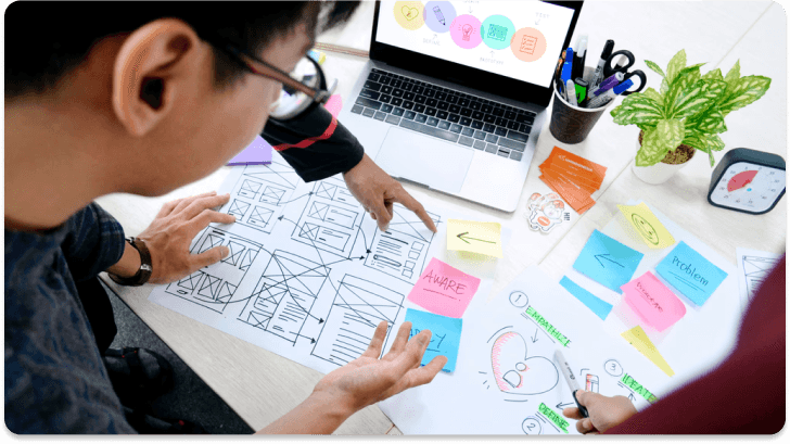
Step into the journey of a unique project. Here, I unravel the threads of my thought process and exciting steps taken from inception to execution.


The original Myntra app exhibited several usability challenges:
Navigation Issues:
The bottom navigation menu was inconsistent with user expectations, deviating from the familiar patterns seen in similar apps like AJIO and Meesho. According to Jakob's Law, users prefer interfaces similar to those they are accustomed to, and deviation caused an increased cognitive load.
Overwhelming Choices:
On the homepage, users were presented with numerous options—offers, discounts, and branding—making it difficult to locate key categories. This violated Hick’s Law, which states that the time required to make a decision increases with the number and complexity of choices.
Visual Discomfort:
The use of certain visual elements, such as the blue background on the cards, created an unpleasant visual experience, which reduced usability. This went against the Aesthetic-Usability Effect, where users perceive more aesthetically pleasing designs as easier to use.
Accessibility and Feedback:
Important actions were not optimally placed within reach of users, which increased the difficulty of interaction, violating Fitt’s Law. Additionally, a lack of visual feedback during actions such as loading hindered users from understanding the system status.
To address the navigation issues, I redesigned the bottom navigation bar based on Jakob's Law, making it consistent with familiar e-commerce platforms, reducing cognitive load. The homepage was simplified by introducing a clear category section, following Hick’s Law to make decision-making easier. Visual design improvements, including optimized background colors and layout, enhanced overall appeal. Key action targets were repositioned for better accessibility, applying Fitt's Law, while visual feedback mechanisms like progress bars ensured users were informed of system status. These improvements significantly enhanced the usability and overall experience of the Myntra app.
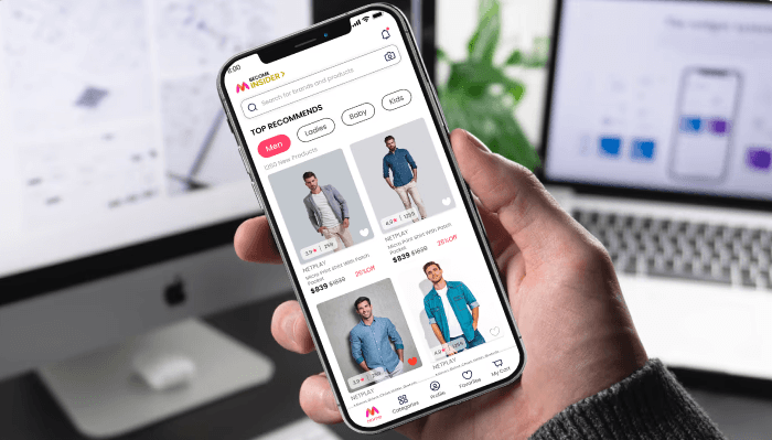
The redesign of the Myntra app focused on addressing critical usability issues that were impacting user satisfaction and overall experience. By aligning the navigation with familiar patterns, simplifying the homepage, enhancing visual appeal, and improving action accessibility, the redesigned version reduced the cognitive load on users and made the app more intuitive and user-friendly. Furthermore, the incorporation of feedback mechanisms and error prevention features ensured that users felt in control throughout their journey. These changes resulted in an improved user experience that aligns with usability best practices and promotes user engagement and satisfaction.
Stay informed with the latest guides and news.

12 Hours Design Challenge-Maternity App
I designed a maternity app home screen with seamless navigation for tracking, consultations, and medical records.
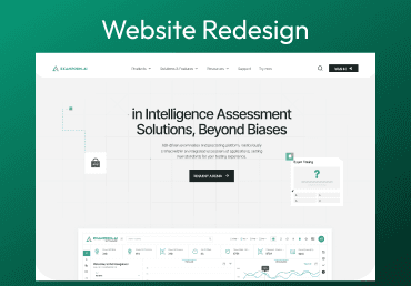
Website Redesign
ExamRoom.AI is an innovative AI-powered proctoring platform that enables secure and seamless online assessments.

Lokha Spandana 2.0
Designed a application for easy create duty, Assigned officers, and records access.